QLess: Customer Engagement Center
- Timeline: December 2016 - present
- Role(s): UX Strategist, UI Designer, Senior Front-End Developer, Customer Advocate
- Tools: Wireframes, Rapid Prototypes, Front-End Engineer, RESTful APIs
QLess is a SaaS platform that seeks to reduce the time that people spend waiting needlessly in line. Customers are allowed to get in line from anywhere - their own home, a mobile app, at a merchant location - and they can use the time otherwise spent waiting in a lobby however they like. QLess allows users to be notified via SMS when their spot in the line will soon be called for service.
Absract the human element out of consideration, and what QLess actually serve is a very impressive workflow management system, where complex algorithms determine the fastest path multiple units can take through a workflow.
I joined QLess in 2014 and have been working to improve the brand and user experiences of the entire portfolio of software products.
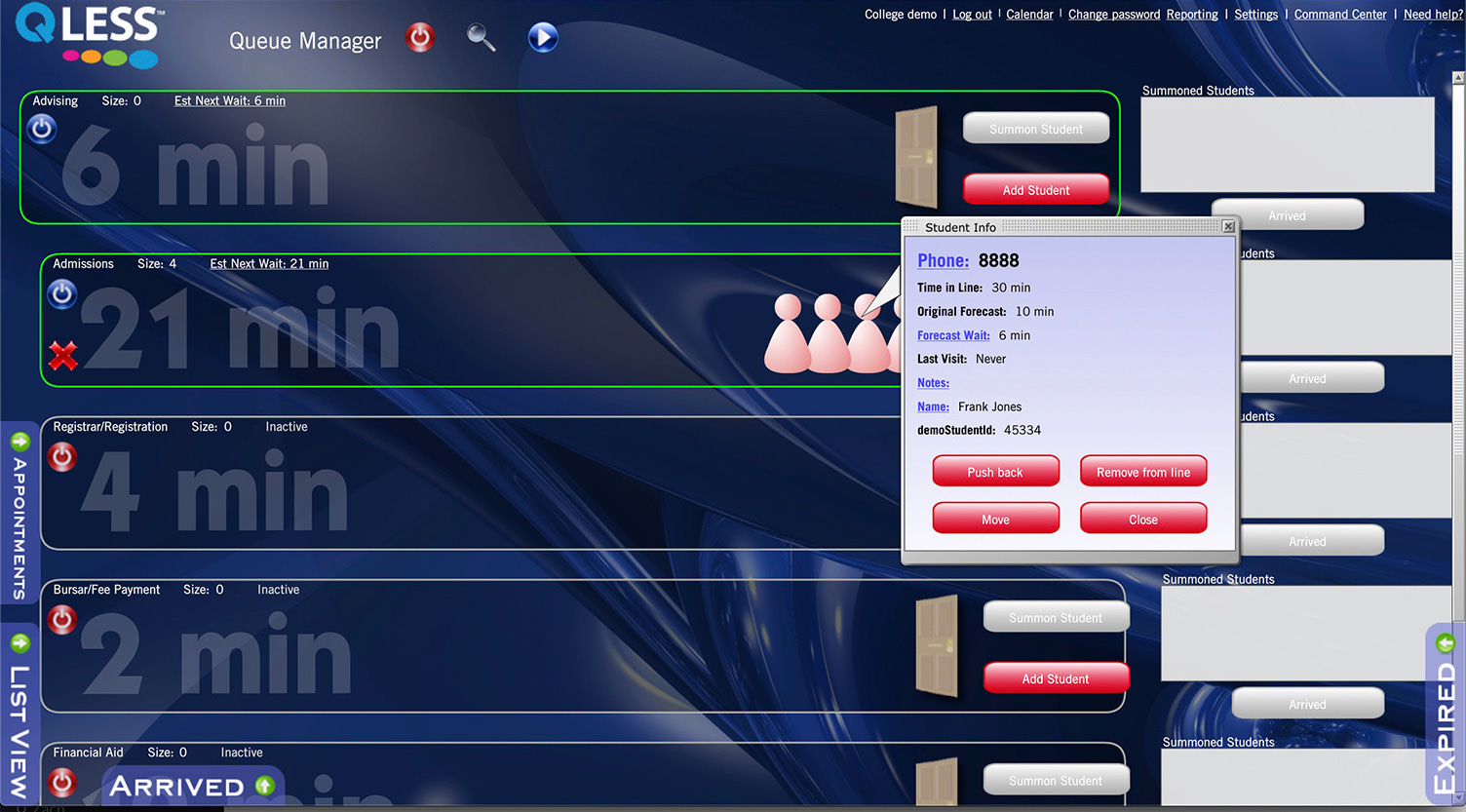
QLess Queue Manager was the primary application designed early in the company's beginning as a tool for a merchant's employees to view, summon, and service customers waiting in lines. As is common with many start-ups or small companies, this product grew organically over time with little time for re-design or assessment of usability. As a result, the product had a number of features that were inconsistent in their implementation, adding new features supported by the platform became very difficult and costly, and users found the usability difficult and cumbersome.
The product was also Flash-based, making it impossible to use on mobile devices and limiting which browsers could access it without difficulty.
The first step to enable a successful re-design was to engage both business stakeholders and merchant employees to understand specific pain points the existing software caused and opportunities that a re-design could bring. A challenge in any re-design project is determining how much learned behavior has been established and how much change users will allow or adopt, which can limit how greatly the main components can be varied from their original.
I spent a lot of time understanding user's concerns and frustrations with the existing software. I read through support tickets, client meeting notes, and talked directly to users to gain as much information as possible. Designers often times "know what is best", until they spend a day in the shoes of an actual user.
I then listened to stakeholders to understand and document what growth opportunities were being missed or limited by the current application. I was keen to seek for overlaps in feedback between stakeholders and users.
After listening to users and gaining input from stakeholders, I understood the high level challenges to be roughly, but not completely, the following:
The primary mission of QLess is to save people time. If the application could be redesigned to take away some of these blocking or painful items, user's productivity could be increased, satisfaction would go up, and customer retention would be easier to maintain.
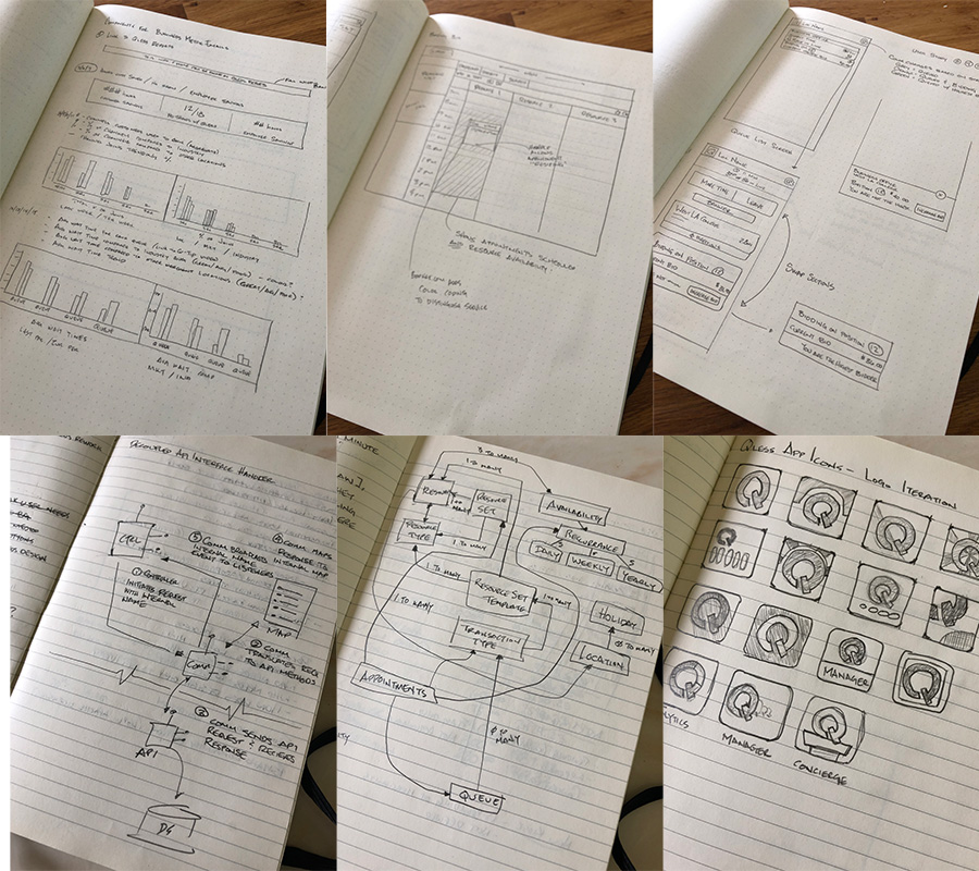
The solution began as sketches discussed internally and then formalized into wireframes. Lofi prototypes were the point at which many stakeholders were able to visualize the solutions proposed and adoption of the design increased.
The application often times showed more information than a user needed to see and felt cluttered.
The solution to this problem was to move everything out of the way. The primary function of the employee is to manage the line or lines they are tasked with. Everything else is rarely used and can be put away. The menu items which previously lined the top of the application were moved to a roll-down menu which can easily be accessed when needed.
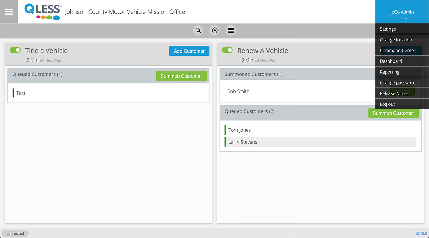
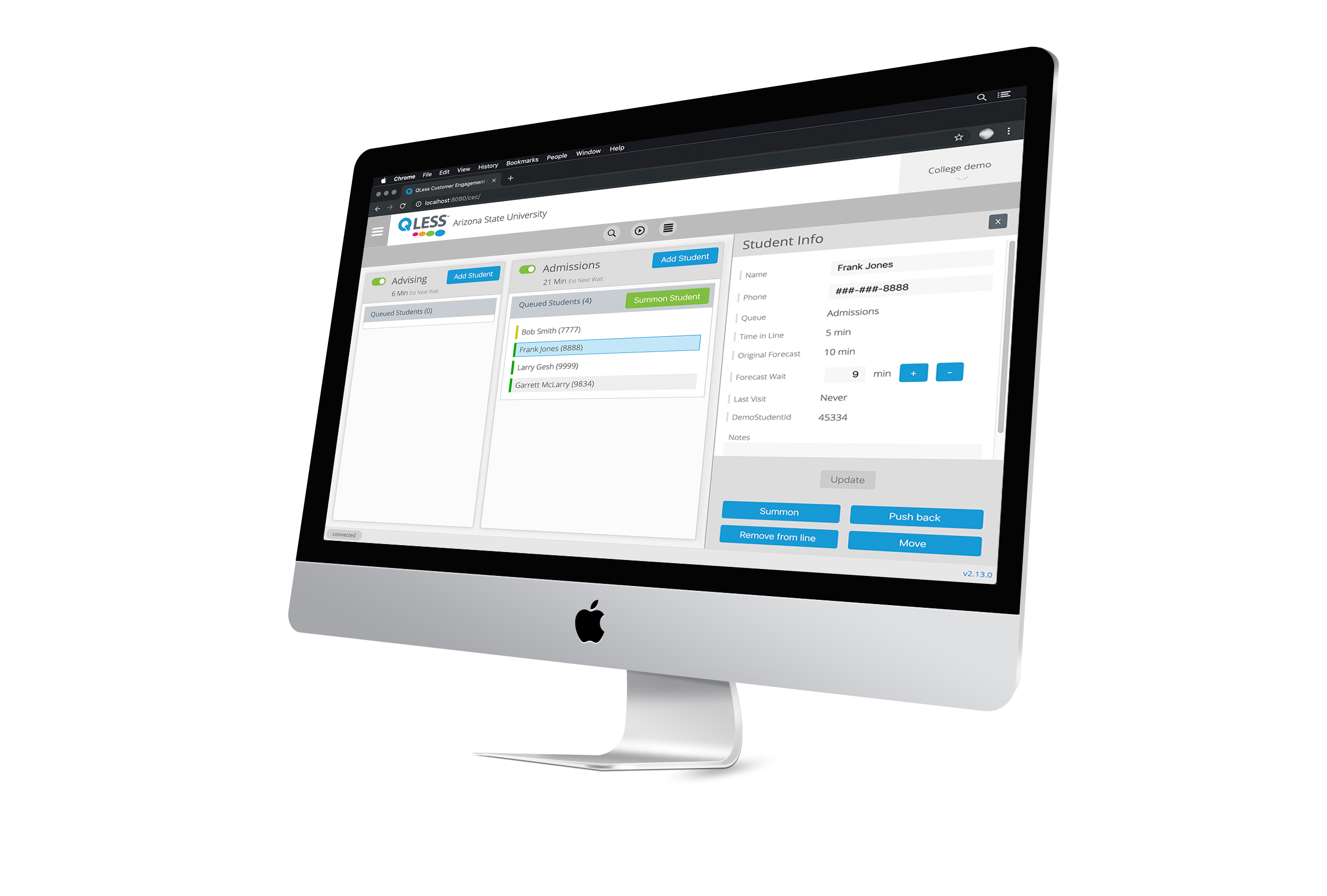
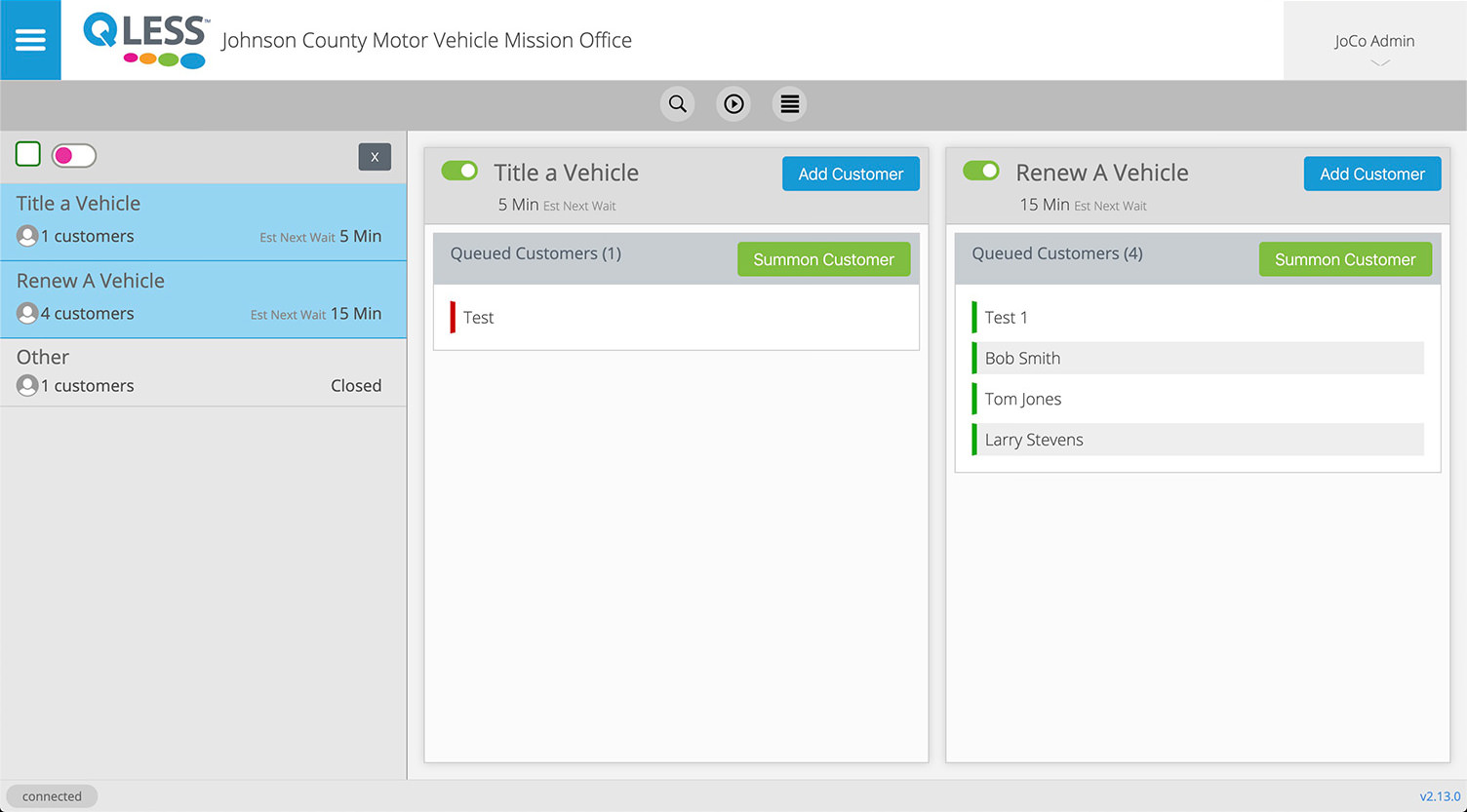
In Queue Manager, all lines were always visible. In the redesign, I enabled the ability to toggle the visibility on and off for individual lines, simplifying the interface to just the information the employee needs to see. By opening a left-hand panel in the view, the employee can see vital, real-time information about each line, without having to clutter their interface with all the consumers waiting in lines they are not servicing.
The application was cumbersome to use. Many seemingly simple operations took several actions.
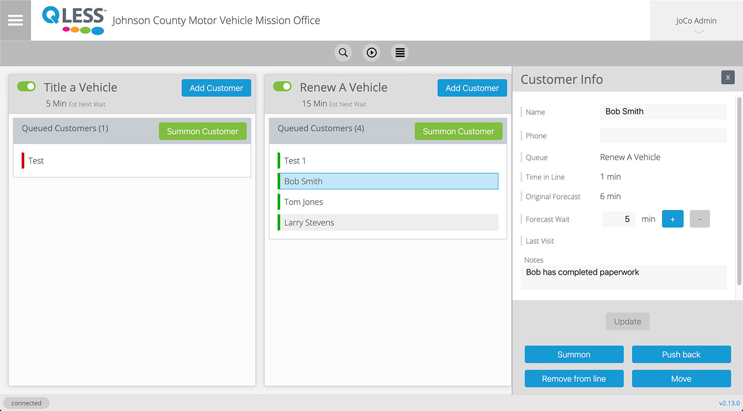
In Queue Manager, customer information could be updated, but only granularly. I redesigned the customer detail interface to be more prominant and allow for all disparate information to be edited and updated at once. Selecting the customer in the line would open a Customer Info panel to the right of the view and that would persist as the employee summoned and arrived the customer. The employee always has access to the information about the customer they are dealing with.
The application sometimes had different information located in disparate locations.
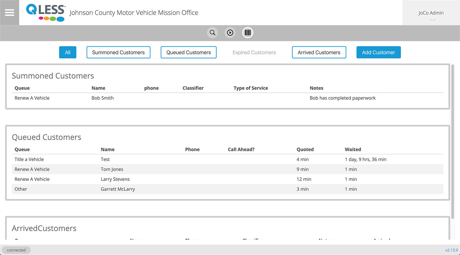
Queue Manager had tabs along the left-hand, right-hand, and bottom of the application, allowing access to different lists of data. I created a new interface that unified all those distinct lists, yet still allowed for users to only see specific sets of data if they select the corresponding button at the top of the view.
The application did not scale well. As a line exceeded a certain number of customers (based on screen size), the avatars would run off the page.
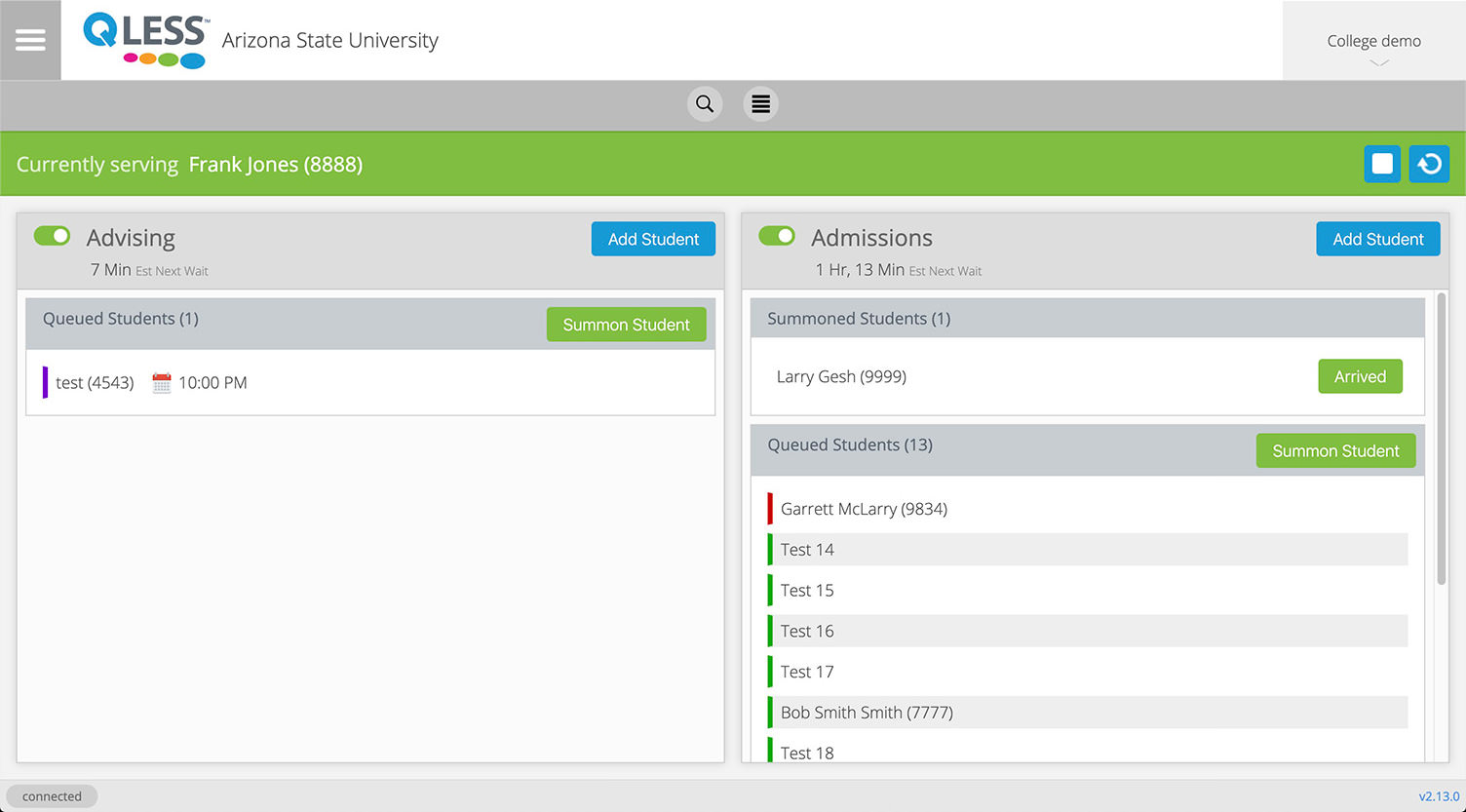
I ran a number of wireframes before I found adoption by users with this vertical list view over the previous horizontal list view. It compacts the space of the summoned consumers (when there aren't any), it scrolls each list when the number of waiting customers exceeds the space available, and it now shows the recently expired customers that Queue Manager only had in a single list view.
The application was becoming unusable as it was difficult to maintain and update new features added to the service.
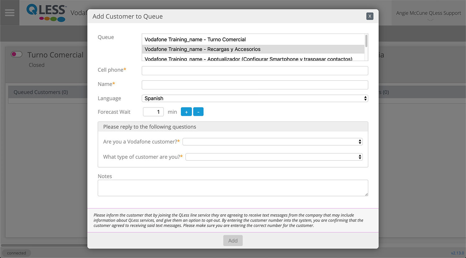
One of the challenges of Queue Manager was in the code it was written in, which made it very difficult to maintain and update. As the platform grew, new features were added. One such feature required that customers (using the customer-facing application) would be required to enter specifiec fields of information. The system would not allow them to get in line unless they filled in the all required information. This caused an issue for employees attempting to put customers in line through Queue Manager, as those fields were not exposed.
I designed the form to add customers to be modular and easily accept new changes to data requirements, allowing employees to have a frictionless experience.
This is a very light view at all the design and experience considerations that were completed and iterated over for the past 2+ years. Another example of a change I introduced was to develop 2 current voice profiles.
Each voice communicates appropriately for the use case the employee encounters. The first is a help/error voice which is largely sympatheic and advisory to how the user can accomplish the task they were attempting when the error occured. When users encounter an error, most applications notify the user that something went wrong... and that's about it. The error voice for this application does that but also suggests other actions the user might take in order to complete their intended task.
The second voice is the more common voice used throughout the application. It is fun and upbeat, but still conveys a sense of reliability and competance.
Adoption of CEC is nearly complete within QLess. All new clients are being set up to use this application. Queue Manager has gone into limited support and sunset is projeted for Queue Manager in 2020, making CEC the principal employee application for the company. Customer satisfaction surveys show an overwhelming increase in satisfaction using CEC over it's predecessor.